
Form Designer
Contents
Helios has comprehensive and flexible workflow and electronic routing for your forms and documents. Forms can be designed and created in Helios easily and incorporated into workflows. Workflow routing and approval paths can be based on complex criteria for reviewing and approval by various steps and people involved.
This document is focused on forms management. For details on how to integrate forms into workflows, consult the Workflow Designer documentation.
Creating Forms
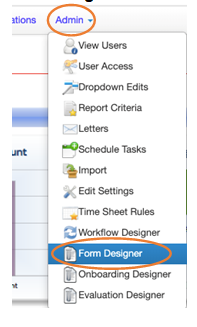
Once you're logged into the admin side of Helios, from the top menu bar, navigate to Admin and then Form Designer
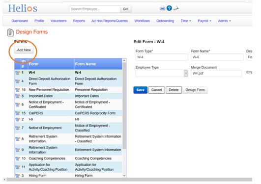
On the Form Designer page, click the Add New button
Type in the details about the new form including Form Type , Form Name, and Description. With Employee Type you can restrict the form to certain employee types, and with the Employee Access? checkbox, you can make the form available to employees through the employee self-service portal.
Once done, click the Save button to save the form details.
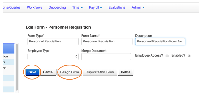
Then click the Design Form button to start designing the layout of the form.
Design the form
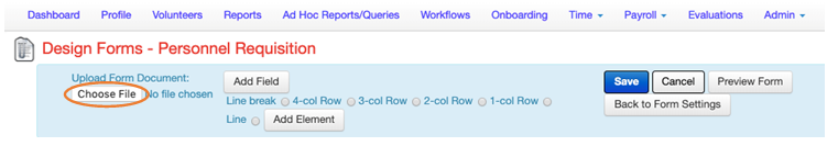
On the Design Forms page, click on Choose File to select an image of the form you want to use. After you select the form image, it will be loaded for you to now create the fields you want on the form.
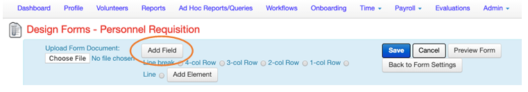
To start adding fields on the form that users can fill in, click the Add Field button.
A dialog box will show up to allow you to enter what kind of field you want.
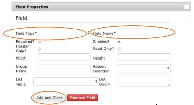
Enter the Field Type which gives you many options to select from:
Enter the Field Name. You can set other options such as Required?, Width, Height, Read Only?, and Header Only? Group Name is used to group fields like radio buttons together-having the same group name for a set of radio buttons allows them to be grouped together and user can only select one option from that group.
Finally, click the Add and Close button. Clicking the Remove Field button removes the field from the form.
After the field is added, you will see it on the right. Now you can drag it anywhere on the form to place it where you want it. To drag the field, click on its name handle and drag it with the mouse.
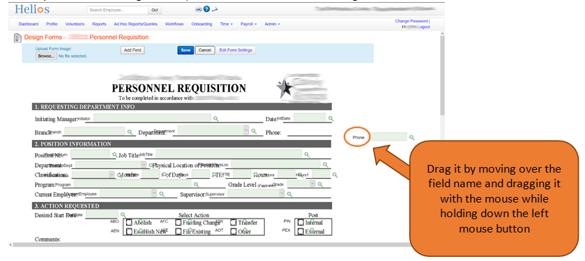
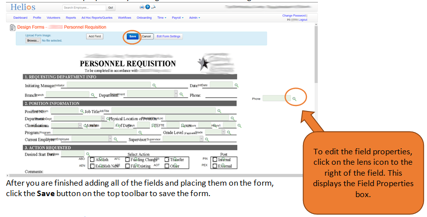
You can edit the field properties by clicking on the lens icon to the right of the field.
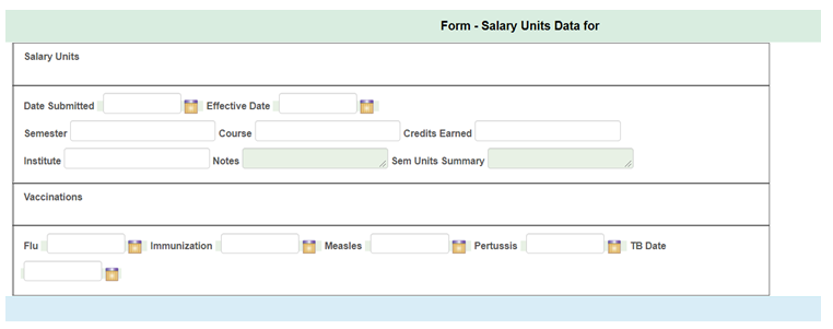
Forms without a PDF
For forms that don't have a PDF behind them, you may want a particular layout with columns. So you can select 4-col Row,3-col Row, 2-col Row, or 1-col Row, and then Add Element.
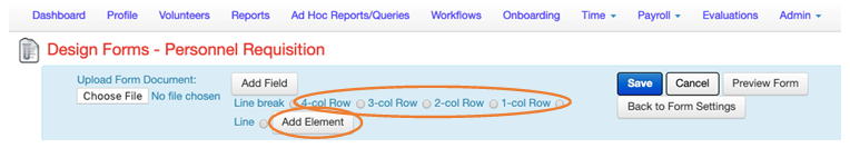
This will create a grid with columns. You can then click Add Field to add fields, and then drag them into whatever part of the column you want.
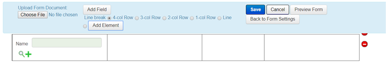
Here's an example of what a form that doesn't have a PDF behind it might look like after some significant layout work:
Saving and previewing a form
If you want to preview what the form will look like to people filling it out, click Save first, and then click Preview Form.
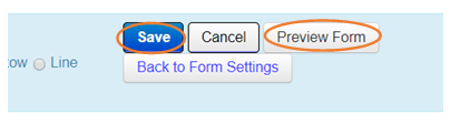
Then you will see a preview of the form appear:
Duplicating and updating forms
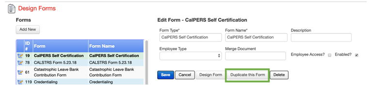
If you need to update forms in future for newer versions, you should Duplicate this Form in Form Designer and create a new version of the form. If you update the form instead of duplicating, the update will change all the forms that past and existing employees have completed. If the form needs to be updated in place due to an error, then of course it can be edited so that the change will take effect immediately.